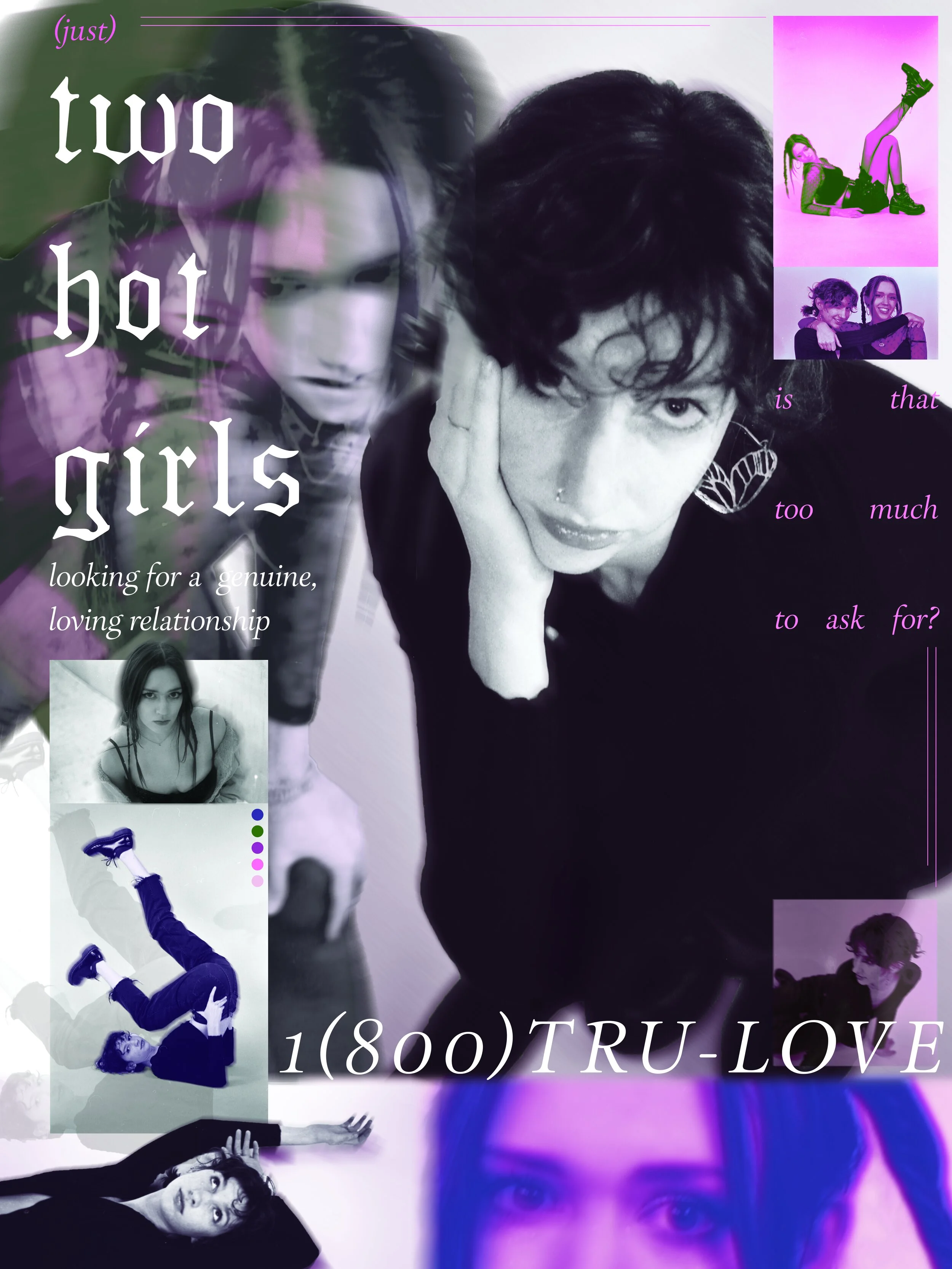
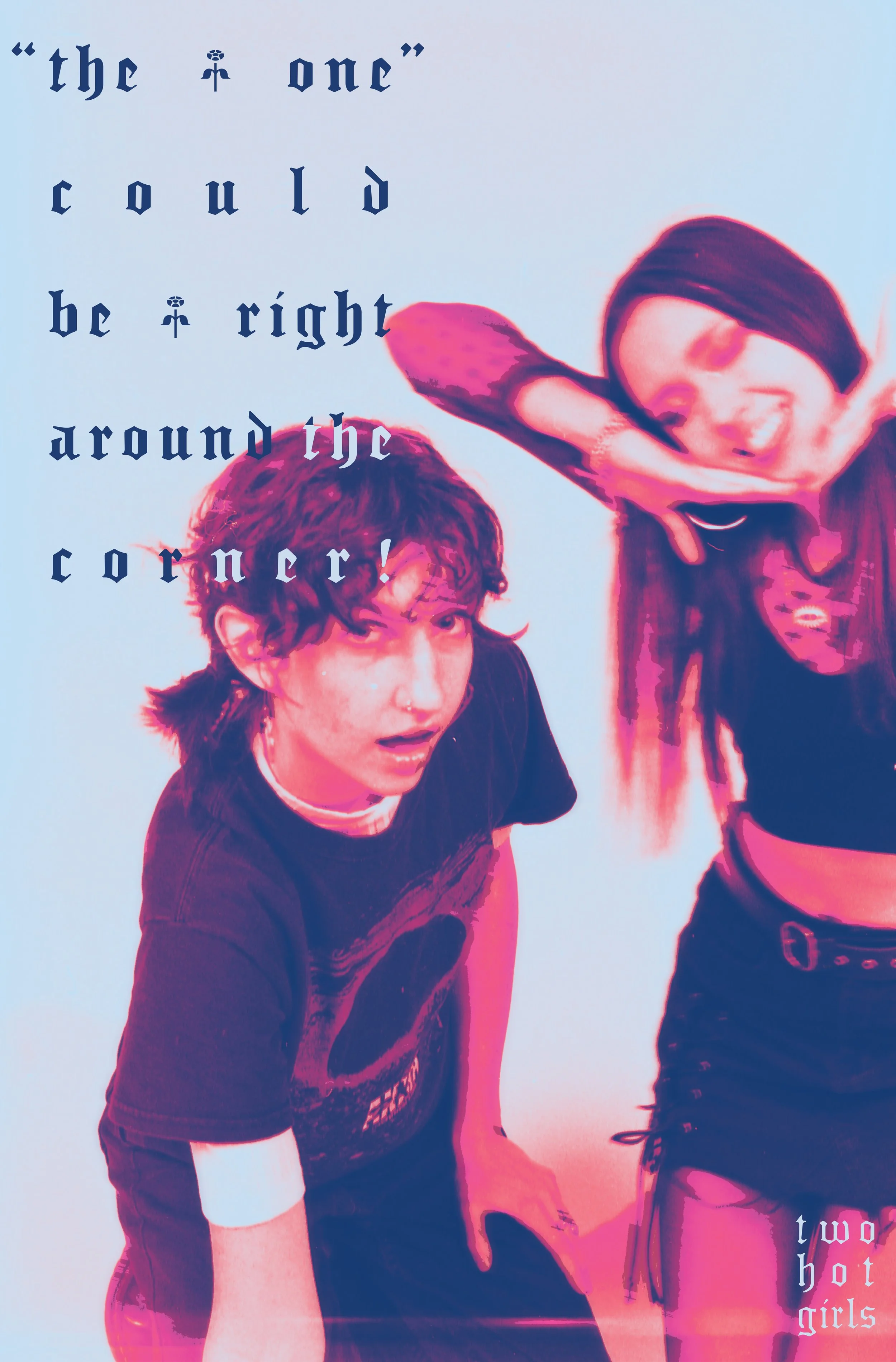
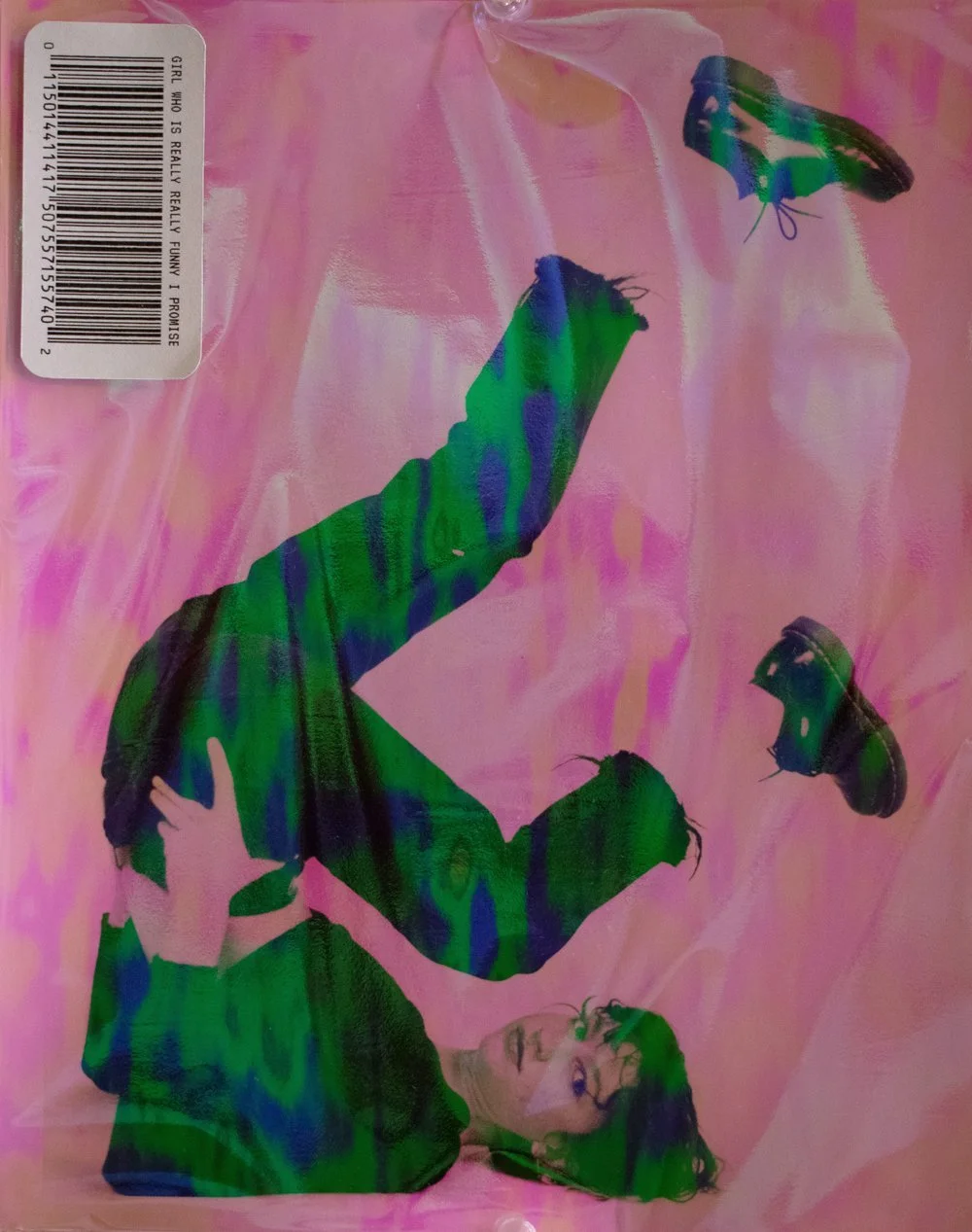
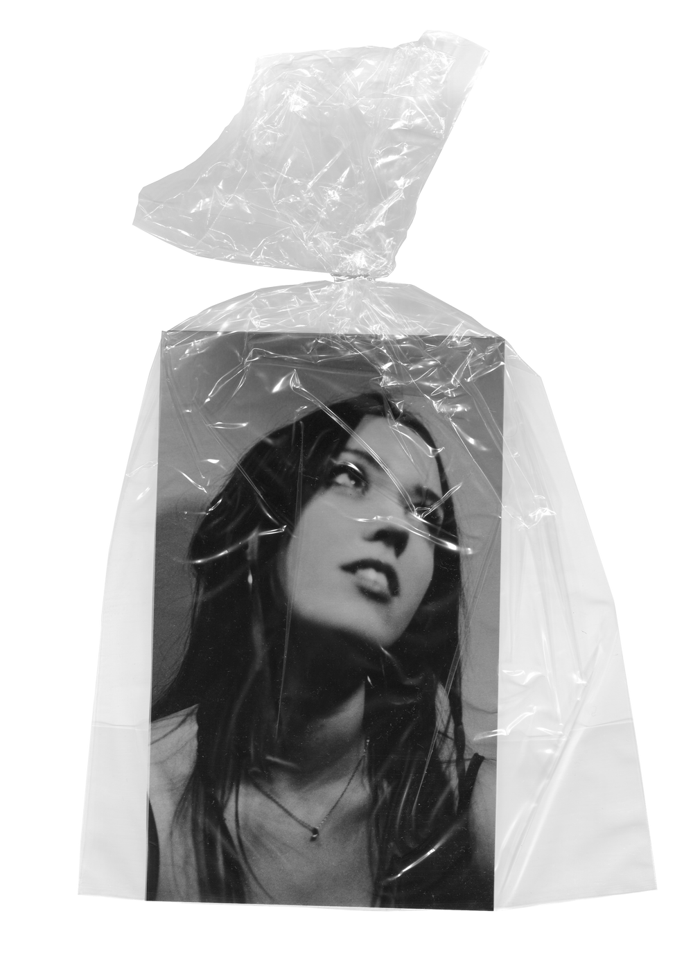
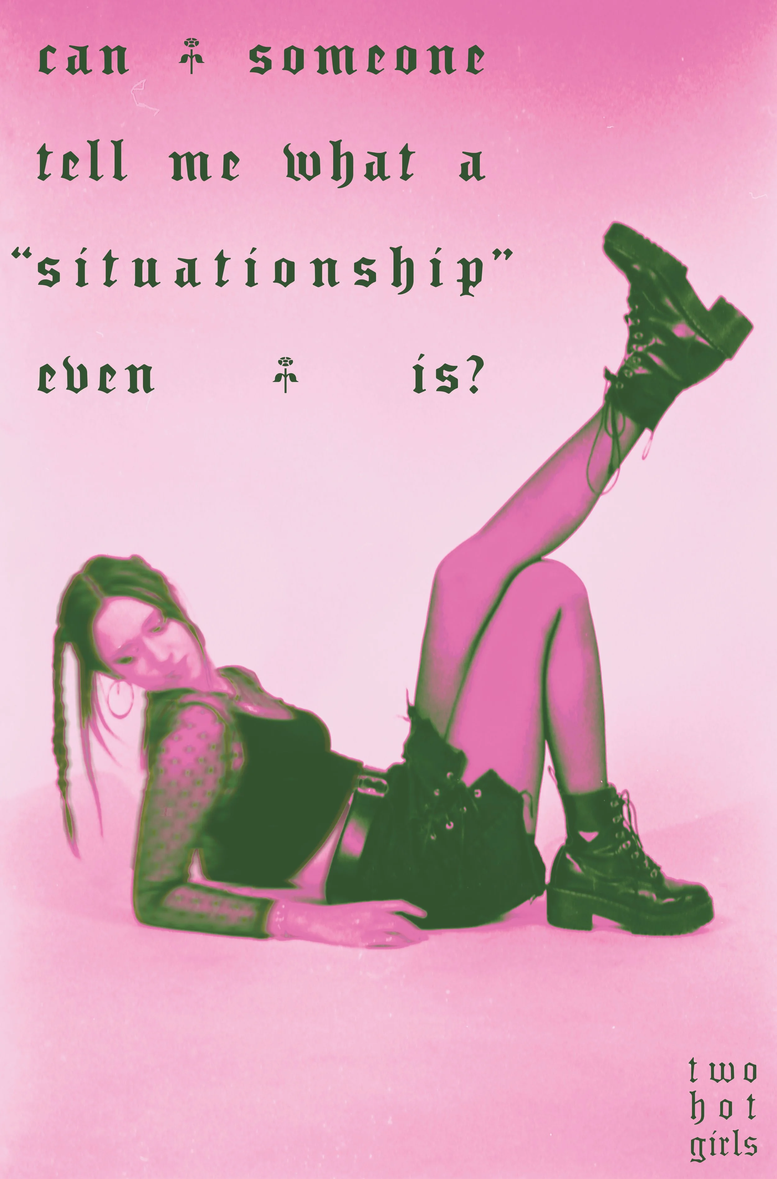
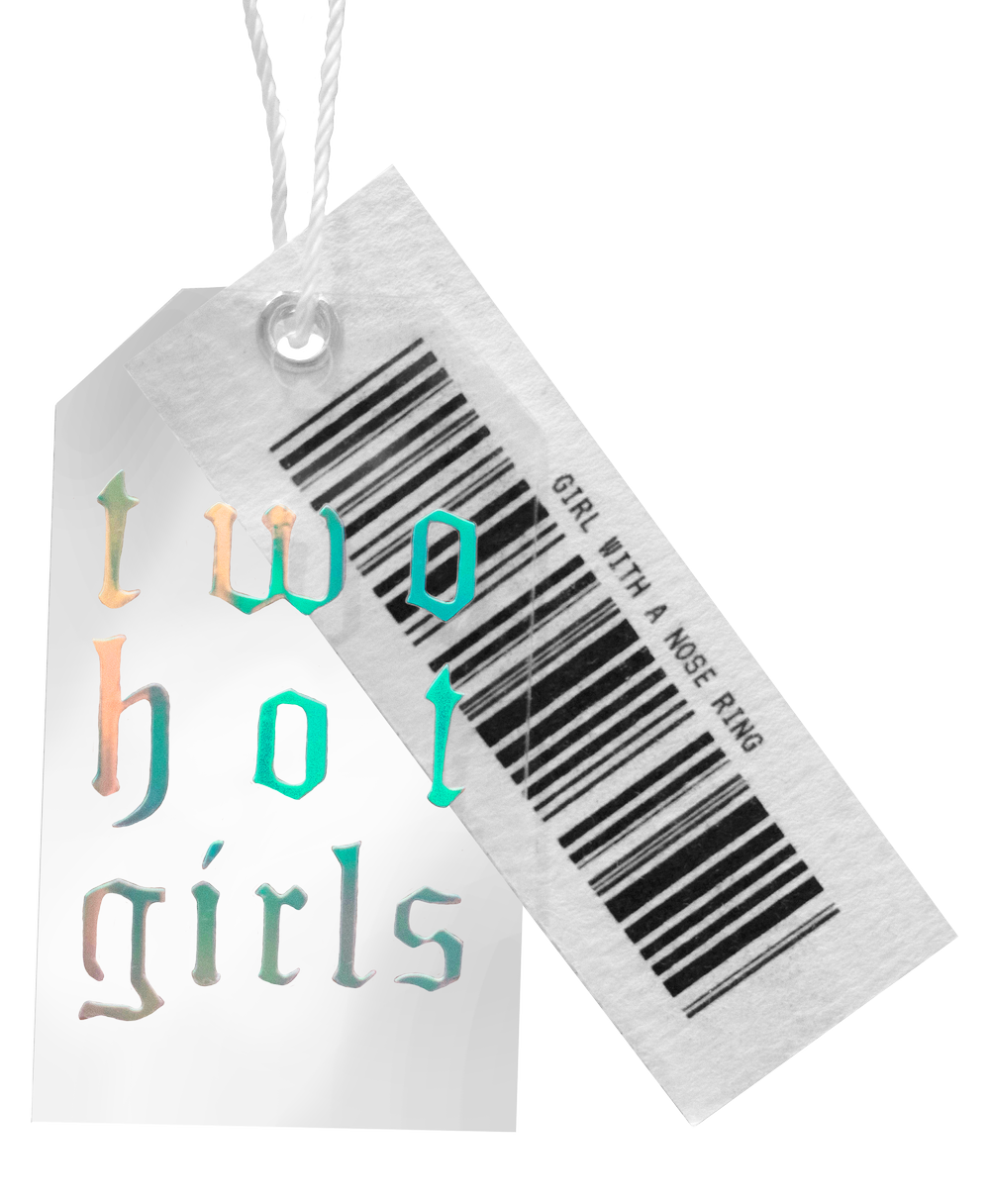
The idea of “2 Hot Girls” was initially conceived as a joke about the pros and cons of running an ad campaign to find a boyfriend, due to our shared frustrations of the online dating scene. As time passed however, the conversation about the similarities between these two ways of putting yourself out there continued. When the opportunity arose in our classes to create whatever we wanted, we knew we had to take the chance and see how far we could push this concept of an ad campaign used as a tool for dating.
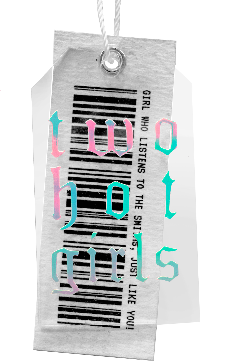
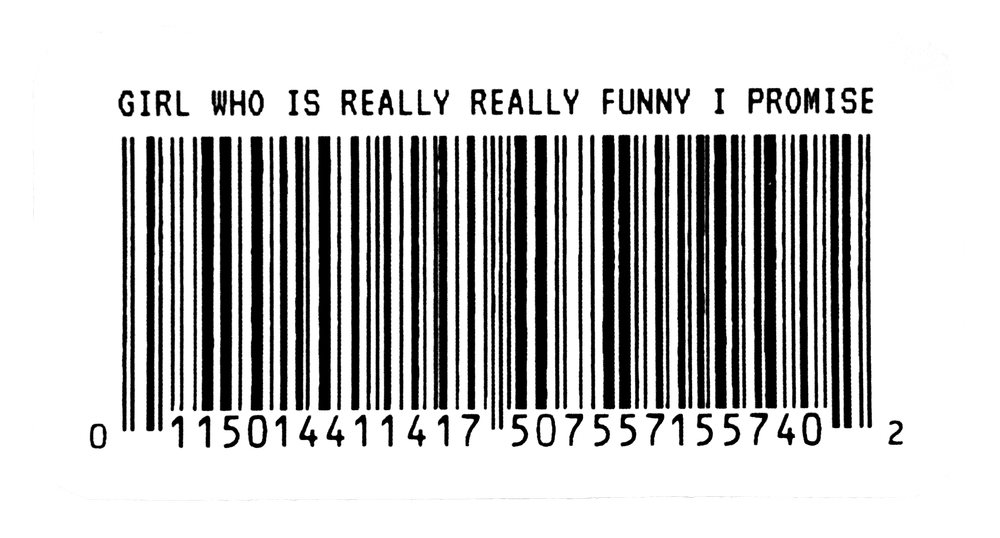
To fully flesh out the idea, the “2 Hot Girls” manifested in two different ways. The portrait film photography presented us as the “product”, complete retail elements such as hangers, barcodes, and tags, that the subsequent ad campaign would be advertising to our audience. These two elements work in tandem to fully communicate the vision of the project.
Project
Poster design
Advertising
Film photography
Mixed media
In collaboration with
Lydia Rang
Year
2022
-
This concept originally started as a joke between Lydia and I during the summer break. as we grew more and more frustrated with the lack of success for us in the online dating scene. We jokingly said we should just put up posters for ourselves with our phone numbers attached, post them up over campus, and just wait for the results. But the idea stuck with us as time passed, and so when the opportunity arose in our classes to create whatever we wanted, we knew we had to take the chance and see how far we could push it.
The thought process behind doing a play on an ad campaign stemmed from the similarities between it and what a dating profile profile is. Just like ads, you are working with increasingly short attention spans online, so whatever you release, it better be eye-catching. There is a pressure when creating your online persona to include all your best pictures, your funniest anecdotes, your coolest fun facts, all for the chance that someone you fancy might come along and “swipe right”. To bring this pressure into the real world, we dressed in cute outfits, did fun makeup, shot four rolls of film, and tried out different poses, all to play up the performative nature of the concept. I do want to note however, that our appearance is still rooted in reality. The goal was not to make ourselves into something we are not, but rather to enhance characteristics that are true in the hopes of grabbing “the right person’s” attention. Take our outfits and makeup. Yes, we like dressing up, but it’s not how we always look, nor is it the only interesting aspect about us.
This enhanced reality extends to the editing process and final visuals. The bright colors and punchy editing are in a style we enjoy, and exaggerated in a way that will catch a person’s eye walking past. As for the typographic elements, they create the “brand” persona that encompasses the campaign. The name “Two Hot Girls” was part of the initial joke, and it became the overall “brand” name. The phrase encompasses the irony of the project. We want to portray ourselves as desirable as possible, but in reality we are so frustrated by the lack of romantic connection that we do not feel very “hot” at all. The accompanying phrases present throughout the prints express this exasperation, and contrast with the over-the-top visuals to convey the vulnerability at the center of the project. This project provided a space to tap into all those common feelings of insecurity, frustration, and hope that come with being single in college, but in a fun and stylish way that was a pleasure to create.

